Health
Track customization trends over time and identify degrading or stabilizing scopes. The Health Dashboard is designed for governance leads who need visibility into technical debt across application scopes.
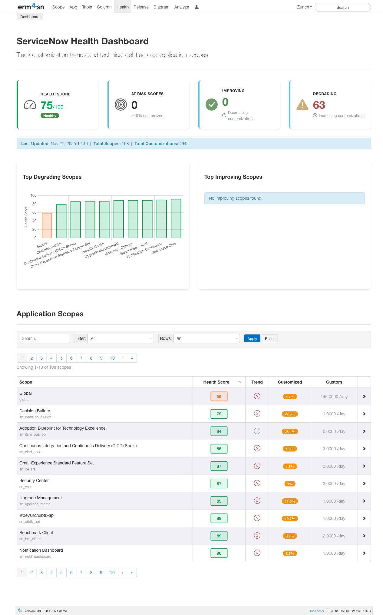
Dashboard Overview
The Health Dashboard provides an at-a-glance view of your ServiceNow instance's customization health:
- Health Score: Overall health rating (0-100) based on customization levels across all scopes
- At Risk Scopes: Number of scopes with ≥40% customization that may cause upgrade issues
- Improving: Scopes where customizations are decreasing over time
- Degrading: Scopes where customizations are increasing over time
The dashboard also shows summary statistics including total scopes monitored, total customizations tracked, and when data was last updated.
Top Degrading & Improving Scopes
The bar charts highlight which scopes are trending in the wrong direction (increasing customizations) and which are stabilizing. This helps you prioritize governance efforts on the scopes that need attention most.
Application Scopes Table
Below the charts, a searchable table lists all application scopes with their key metrics:
- Scope: The application scope name
- Health Score: Individual health rating for each scope
- Trend: Visual indicator showing if the scope is improving, stable, or degrading
- Customized: Number of OOB records that have been modified
- Custom: Number of new records created by your team
Use the search box to find specific scopes, or filter and adjust the number of rows displayed.
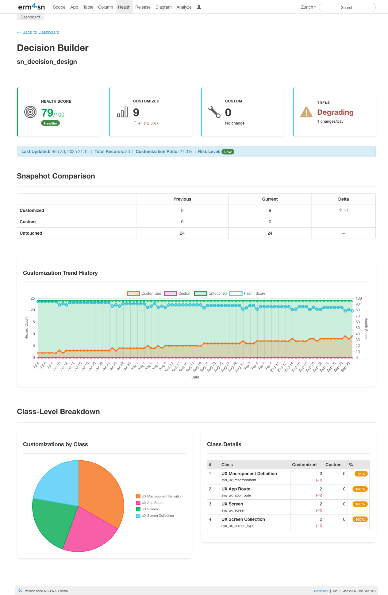
Scope Detail View
Click any scope to drill into its detailed health metrics:
- Health Score: The scope's individual health rating
- Customized: Count of OOB (out-of-box) records that have been modified (with change percentage)
- Custom: Count of new records created by your team
- Trend: Whether the scope is improving, stable, or degrading (with change velocity)
Additional context is shown including total records, customization ratio, and risk level.
Snapshot Comparison
The comparison table shows how customization counts have changed between snapshots:
- Customized: OOB records modified by your team (impacts upgrades)
- Custom: Records created by your team (neutral)
- Untouched: OOB records never modified (healthy)
The Delta column highlights exactly what changed, making it easy to spot recent modifications.
Customization Trend History
The trend chart visualizes how the scope has evolved over time with three key lines:
- Customized (blue): Number of modified OOB records
- Untouched (green): Number of unchanged OOB records
- Health Score (line): The calculated health rating over time
This helps you identify when changes occurred and whether governance efforts are working.
Class-Level Breakdown
At the bottom, a pie chart and table break down customizations by class type (e.g., UX Macroponent Definition, UX App Route, UX Screen). This shows exactly which types of records have been customized within the scope.